Design Principles // Exercises

Wong Wan Jun (0338248)
Bachelor of Computer Science (School of Computer Science and Engineering)(Minor)Design Principles // Exercises
LECTURES
Week 1: Module Briefing (24.08.2021)
During first lecture, Ms Jinchi briefed us about the modules information
and way to submit exercises on Google Classroom. Besides, she mentioned
that our blog should be included work in PDF file, recap of lectures,
visual research, idea exploration with brief descriptions, feedback from
lecturer, final design outcome with brief rationale and brief reflection
for the week.
Ms Jinchi provided us lecture slides and video:
Lecture 0: Introduction (Design elements & principles)
Ms Jinchi provided us lecture slides and video:
Lecture 0: Introduction (Design elements & principles)
Elements of Design:

|
| Fig1.0: Design Elements |
- Point
- simplest element
- used as repetitive mark to form a line
-
Line
- can be active / static, aggressive / passive, sensual / mechanical
- can indicate directions, imply volumes, suggest motion / emotion
- can be grouped to depict qualities of light & shadow (form patterns & textures)
- Shape
- refers to expanse within the outline of 2D area / 3D object
- visible when lines enclose an area or apparent change occurs in lightness/darkness
- general category:
- geometric
- circles, squares, triangles, etc
- tend to be precise & regular
- organic
- Form
- 2D area = shape; 3D area = form
- when form encloses space, space = volume
- form is often major element in sculpture & architecture
- imply in 2D media, eg: painting, illustration, drawing
- Texture
- tactile qualities of surfaces
- all surfaces have textures that can be experienced by touch/visual
- category:
- actual (experienced by touch)
- simulated / implied (created to look like real texture)
- Space
- indefinable, general receptacle of all things
- actual space of each picture's surface is defined by edges (2D - heights & width)
- from the outside of 3D space, we experience mass while inside for volume
- in graphic design, space/depth = area that a shape/form occupies
- defined as positive(filled space) / negative(empty space)
- illusion of 3D space can be suggested through depth
- achieved by overlapping of images, variation of sizes, placement and perspective
- Colour
- the visual byproduct of spectrum of light
- human distinguish colour in terms of
- hue
- colours of spectrum, eg. yellow & green
- value
- lightness / darkness from white -> greys -> black
- black & white is important in changing of colour value.
- white added to hue = tint; adding grey to hue = tone; adding black to hue = shade of the hue
- intensity(saturation / chroma)
- purity of a hue
- pure hue is the most intense form of given colour, it is the hue in its highest saturation, in brightest form
- with pigment (black/ white/ grey) of another hue is added to a pure hue, intensity diminishes and dulled
- colour schemes
- colour groupings provide distinct colour harmonies
- monochromatic colour schemes
- based on variations in value and intensity of single hue
- analogous colour schemes
- based on colours adjacent to another on the colour wheel, each containing same pure hue
- complementary colour schemes
- emphasise two hues directly opposite each other on the colour wheel
Lecture 1: Contrast & Gestalt Theory

|
| Fig1.1: Principle of Design |
Contrast
- the juxtaposition of strongly dissimilar elements
- visual experience would be monotonous without contrast
- provide visual interest, emphasise a point and express content
Gestalt Theory
- human brain tend to see patterns, logic, structure
- Gestalt = shape / form in German
- rules that describe how human eye perceives visual elements
- aim to show how complex scenes can be reduced to more simple shapes
- explain how eyes perceive shapes as single united form rather than separate simpler elements

|
| Fig1.2: Gestalt Principles |
- Principle of Similarity
- human eye tends to perceive similar elements in a design as a complete picture or group.
- brain crafts a link between similar elements
- Principle of Continuation
- human eye follows paths, lines, and curves of a design
- they prefers to see a continuous flow of visual elements rather than separated objects
- Principle of Closure
- human eye prefers to see complete shapes
- user can perceive a complete shape by filling in missing visual information when visual elements are incomplete
- Principle of Proximity
- process of ensuring related design elements are placed together
- unrelated items should be spaced apart
- close proximity = items connected become one visual unit
- Principle of Figure / Ground
- instinctively perceived as being either in the foreground or the background
- either stand out prominently in the front (the figure) or recede into the back (the ground)
- Law of Symmetry & Order
- symmetrical elements tend to be perceived as a unified group
Week 2: National Day (31.08.2021)
This week, we are going to start our exercise 2 and continue working on our
exercise 1. As today is National Day, we have no class. I have watched the
lectures videos and slides provided for better understanding on balance &
emphasis.
Lecture 2: Balance & Emphasis
Balance
- distribution of visual weight in design
- visual equilibrium of the elements that causes image appears balanced
- category
- symmetrical
- equal “weight” on equal sides of a centrally placed fulcrum
- equal elements arrangement on horizontal or vertical = bilateral balance
- elements equally around central point = radial balance
- equivalent but not identical form = approximate symmetry
- asymmetrical
- unequal visual weight on each side of composition
- one side might contain dominant element (could be balanced by a couple or more lesser focal points on other side)
- more dynamic and interesting
- offers more visual variety

|
|
Fig1.3: Balance design by Han Valor |
Golden Ratio (phi)
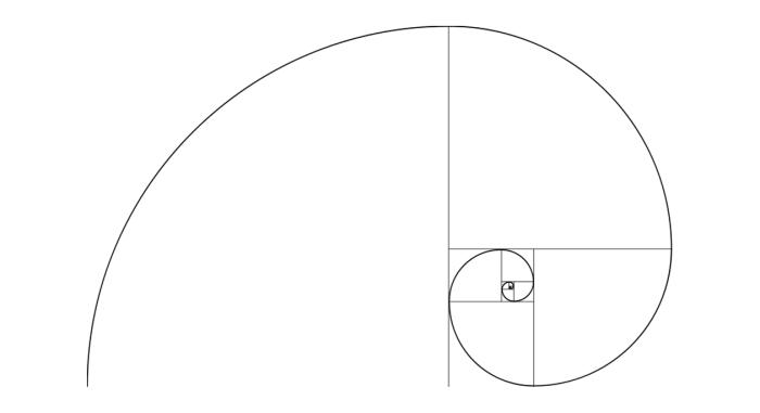
|
| Fig1.4: Golden Ratio |
- a mathematical concept comes from Fibonacci sequence
- representative of perfect beauty
- guide to create visual balance in architecture and paintings
- used to bring harmony, balance and structure
- increase the appeal of design
Rule of Thirds

|
| Fig1.5: Rule of Thirds |
- composition guideline to create more dynamism
- image is divided evenly into thirds ( horizontally & vertically)
- subject of image is placed at intersection /along one of the lines.
Emphasis & Dominance
- used to create dominance & focus
- various elements can be used to create emphasis, eg: colour, shapes/value
Week 3: Progress Checking on Ex1 & 2 (07.09.2021)
This week, we are going to start our exercise 2 and continue working on
our exercise 1. As today is National Day, we have no class. I have
watched the lectures videos and slides provided for better understanding
on balance & emphasis.
Lecture 3: Repetition & Movement
Repetition(Pattern & Rhythm)

|
|
Fig1.6: Repetition in Pattern |

|
| Fig1.7: Repetition in Rhythm |
- make a design seem active
- repetition design elements creates rhythm & pattern within work
- variety is essential (keep rhythms exciting & active & avoid monotony)
- change/slightly different in elements & objects in composition
- avoid boring composition
- involve varying angles, exposure, composition, etc.
- essential (keep rhythms exciting & active & avoid monotony)
- pattern increases visual excitement (by enriching surface interest)
Movement
|
| Fig1.8: Movement in Design |
- way of design leads eye in, around, and through a composition (the path followed by eye)
- occurs when objects seem to be moving in a visual image
- comes from used of kinds of shapes, forms, lines & curves
Hierarchy
- the choreography of content in a composition (to convey information)
- direct viewers to the important information first, identifies navigation through secondary content
Alignment
- placement of elements in a way that edges line up along common rows/columns
- creates sense of unity & cohesion (contributes to design's aesthetic & perceived stability)
- powerful means of leading a person through design
Week 4: Progress Checking on E-portfolio (14.09.2021)
Lecture 4: Harmony & Unity

|
|
Fig1.9: Unity & Harmony in Design |
Harmony
- involves the selection of elements that share a common trait.
- becomes monotony without variety(change or slight difference in elements & objects, varying angles, exposure, composition, etc)
- the sense that all of the elements of your design fit together (may fit the same theme, aesthetic style or mood).
Unity
- repetition of particular elements (colours, shapes, materials :to pull the look together) throughout design.
- occurs when these elements are composed in balanced and give a sense of oneness, creating a theme.
Scale & Proportion
- both design elements that have to do with size.
- Scale
- size of one object in relation to the other objects
- size and dimension of figures and forms relative to a specific unit of measure.
- determined in 2 ways
- actual measurement
- visual estimates based on comparison
- eg of implementation: Architectural drawings and scale models
- used to specify or illustrate details based on the relative sizes of objects.
- Substantial deviation from a normal scale relationship create dramatic results and visual interest.
- Proportion
- size of the parts in relationship to other parts of the same object.
- relationship of two or more elements in a composition (comparison to one another elements: size, colour, quantity, degree, setting, etc.; i.e. ratio).
- harmonious: correct relationship exists between the elements with respect to size or quantity.
Week 5: Progress Checking on Exercise 3 (21.09.2021)
Lecture 5: Symbol, Word & Image
Symbol
- A sign/shape/object that represent something.
- Convey information, one/more sentences of text/whole story.

|
|
Fig1.3: Symbols from lecture slides |
- Pictorial Symbols
- Image-related & simplified pictures.
- Abstract Symbols
- look like object represented but less detail.
- Arbitrary Symbols
- no resemblance to objects/ideas represented.
- invented with the meaning constructed.
- based on geometric shapes & colours.
Word & Image
- vital part of design, printed/ digital.
- able to relate to a concept/brand if right images are implemented.
- choosing right words to pair with imagery is important to deepen design's meaning.
- suitable typeface & strategic positioning of type will result in visual hierarchy & balance.
INSTRUCTION
EXERCISES
Exercise 1: Gestalt Theory & Contrast
Gestalt Theory__
The idea of 'grouping' or characteristics of stimuli cause us to
structure or interpret a visual field or problem in a certain
way, and the primary factors that determine grouping were:
- Continuation
- Closure
- Similarity
- Proximity
- Symmetry
- Figure / Ground
Visual Research
I first explore pinterest looking for inspiration and ideas for gestalt.
After looking some designs, I realise that it was general implemented in
poster and logo designs. Through gestalt theory, the content of poster is
obvious and more likely to attract people. I prefer to go with figure ground
design, thus I searched for some example.


|
| Fig2.0: Gestalt reference from pinterest |
Idea exploration
As looking so much figure ground design of containing animal elements, I
decided to go with my favourite animal -- whale! Plastic pollution is
definitely a serious problems that we can't neglect and it is related to
whale. To bring out this idea, I first sketch out the whale and some rubbish
in its stomach.

|
| Fig2.1: First Sketch of Gestalt |

|
| Fig2.2: First Draft for Gestalt Design |
For the second sketches, I draw facial expression besides whale as I tried
to connected human and whale. I hope that it brings alert of plastic
pollution to human so that whale protection will be more valued.

|
| Fig2.3:Second Sketch of Gestalt |

|
| Fig2.4: Second Draft for Gestalt Design |
After received feedback, I tried to observe more on pile rubbish to have a better drawing on that. I found different variety of rubbish and observe how to draw their outline.

|
| Fig2.5: Pile of rubbish outline reference |

|
| Fig2.6: Final Gestalt Design |
Feedback
Ms Jinchi commented on my draft that the outline of the rubbish in whale
stomach should be more refined by adding more variety of rubbish (eg.
canned) and the combination of both whale draft will be nice.
Contrast___
Apart from that, another idea appeared when I saw somebody put some decoration on their umbrella's handle. Imagine if it is a tiny kid seating on umbrella's handle, just like how we take shelter from rain. How cute will it be! Thus, I tried to sketch it out.
- the juxtaposition of strongly dissimilar elements
- visual experience would be monotonous without contrast
- provide visual interest, emphasise a point and express content
- refers to the arrangement of opposite elements (through colour, line, shape, texture, size and composition)
Visual Research
I have did some exploration on contrast design and I found a lot of
design implemented colour and size to create the contrast effect. It
was quite direct and easy to observe that.

|
| Fig3.0: Balance & Contrast design by Han Valor |

|
| Fig3.1: Contrast design from pinterest |
Idea exploration
The idea of contrast inspired by butterfly. As it have a big wing
and small body, it is an obvious contrast creature. However, I am
not satisfied to draw butterfly only as it was too normal and I
would like to make it more specific. An idea came to my mind which
is a fairy with a pair of big wing and some pattern on its
wing.

|
| Fig3.2: First Contrast Sketch |

|
| Fig3.3: Refined First Contrast Sketch |
Apart from that, another idea appeared when I saw somebody put some decoration on their umbrella's handle. Imagine if it is a tiny kid seating on umbrella's handle, just like how we take shelter from rain. How cute will it be! Thus, I tried to sketch it out.

|
| Fig3.4: Second Contrast Sketch |
Among two designs, I prefer the second design. For me, the contrast idea can be express more on it by using colour and size elements.

|

|

|
|
Fig3.5: Umbrella Draft |

|
| Fig3.6: Final Contrast Design |
I did not receive any feedback (can't join class due to microsoft
teams is locked.)
Reflection
In this exercise, I learnt that details could affect the whole
composition. In my gestalt design, I didn't realise the importance
of the rubbish's outline. I simply draw out without any reference.
After making some amendment on it, the whole composition looks more
nicely. For contrast, I prefer second design as it is more specific,
implementing more own idea. I learnt the shadow and highlight is
important to make design looks interesting.
PDF Version (Exercise 1)
Gestalt
Contrast
Exercise 2: Emphasis & Movement
Emphasis__
- used to create dominance & focus
- various elements can be used to create emphasis, eg: colour, shapes/value
Visual Research


|
| Fig3.0: Emphasis Reference from pinterest |
Idea exploration
We always switch off the light for the birthday celebration and
left only candle light on cake. The candle light was emphasised
as dark surrounding was a contrast with bright candle. That is
the inspiration of my emphasis design. Parents are just like
candle, they keep burning themselves to lead us. The candles
surround represent us, be ready to grow up and lead
others.


|
| Fig3.1:Sketched & Coloured Bright Candle |

|
||
Fig3.2: Emphasis Sketch
|

Black background does made emphasis looks obvious, but I still
considered to make some amendment to bring out idea of emphasis.
I realise that not only colour can be used to create emphasis,
shape is also an important element. Therefore, I enlarge bright
candle and I think it looks better.

|
| Fig3.4: Final Emphasis Design |
Feedback
I did not receive any feedback (can't join class due to microsoft
teams is locked.)
Movement__
- a way of design leads eye in, around, and through a composition (the path followed by eye)
- occurs when objects seem to be moving in a visual image
- comes from used of kinds of shapes, forms, lines & curves
Visual Research


|
| Fig4.0: Movement Reference from pinterest |
Idea exploration
The idea came from tornado and slide. I used the shape of
tornado to create a slide and want to make a visual effect
of people playing this slide. It was quite hard for me to
sketch out the outline of tornado but I did a lot of
observation on that.

|
||
Fig4.1: Movement Sketch
|


|
| Fig4.3: Final Movement Design |
I did not receive any feedback (can't join class due to
microsoft teams is locked.)
Reflection
The emphasis design is quite straight forward to appear in my mind.
The concept of dark and bright is suitable for emphasis. Every time
we looking through our design, we always find something to refine so
it looks better. In my point of view, movement design is more
difficult than previous exercise. I was almost stuck in every step
of it, from sketching the tornado, refined the sketch and finally
complete it, I spent most my time in observing and refining the
outline of tornado. Although it was under my expectation, I do
learnt something from it and getting more familiar with my drawing
tablet.
PDF Version (Exercise 2)
Emphasis
Movement
Exercise 3: Harmony & Symbol
Harmony__
- involves the selection of elements that share a common trait.
- becomes monotony without variety(change or slight difference in elements & objects, varying angles, exposure, composition, etc)
- the sense that all of the elements of your design fit together (may fit the same theme, aesthetic style or mood).
Visual Research
   |
||||
Fig5.0: Harmony Reference from pinterest

|

Idea exploration
Harmony effect mostly created by colours and shapes and deals
with how similar things are to one another. The design idea came from crystal ball. I draw some wavy shapes and a
paper boat inside it so the whole design is quite monotony. I decided to use analogous colour for this design as it
brings visually pleasing harmony.

|
| Fig5.2: Sketch for harmony |
After receive feedback, I make some slightly change on the bottle
so it more looks like a bulb.

|
||||||
Fig5.3: Refined Harmony Sketch
|
||||||
|
|


|
|
Fig5.6: Bluish Tone reference |

|
| Fig5.7: Final Harmony Design |
Feedback
Do more research on shape of bottle. The background must be
filled with something to make a sense of harmonious. The design is quite similar as the colour of object and
background is same. Colour of star and moon could be different
colour scheme, set a darker background, bluish tone is
suggested to bottle and boat.
Symbol__
- A sign/shape/object that represent something.
- Convey information, one/more sentences of text/whole story.
Visual Research
Before I explore ideas from pinterest, I didn't know that the symbol
design could be much various than what I imagine. I found a lot of
interesting symbol designs and they all represent different concepts.
The first design is actually a pictorial symbol as there are simplified
picture of whale and waves. The second & third design are example of
arbitrary symbols as it have no resemblance at all to the ideas
represented.

|
|
Fig6.0: Symbol Design from pinterest |

|
|
Fig6.1: Reference from pinterest |

|
| Fig6.2: Hd Celtic Symbols from pinterest |
After received feedback from Ms Jinchi, I do some visual research
on whale dying and do an observation.
  
|
|
Fig6.3: Whale dying in sea reference |
Idea exploration
For my symbol design, I have an idea of designing mother hugging
her child and presented in arbitrary form. The second idea is
related to reference that I found, I would like to implement the element of first design, which is
whale and waves, but change it to arbitrary form.

|
||
Fig6.4: First Sketch for Symbol design
|

First sketch is quite simple as it only implemented punctuation
marks and lines to bring out the idea of mother hugging her child,
it bring a warm feeling to me. The idea of second sketch is quite
similar to the exercise 1 I did for gestalt, it is about the
pollution. Water drop represent sea, where whale lives in. As the
ocean pollution getting serious, whale might not longer fit inside
the ocean in future. The negative space of water drop represent
the ropes, the whale will be trapped if pollution continue.
|


|
|
Fig6.7: Second attempt on Symbol |
I found that it was quite hard to make whale looks more
simplified. I tried to remain the stripes of whale as it symbolise
the whale quite well. Some stripes was not deleted to remained the
idea of whale might not longer fit inside the sea in future
due to ocean pollution. For second design, I add one more 'child' so that it looks less
emptiness and the overall outline become higher.

|
| Fig6.8: Final Symbol Design |
Feedback
Do more research on whale dying and the whale must be more
simplified since this is symbol. It is better to make some slight
changes on 'mother' in first attempt so it looks like a woman with
dress. The whale in second attempt is not visible, just minus the
whale's stripes will be fine.
Reflection
I have learnt a lot in this exercise. On harmony design, it does
not mean that only analogous colour could bring sense of harmonious,
but other colours scheme too. The background and object of design
must not be too similar so that there is a contrast. On symbol
design exercise, a slightly changes could make a design seems better
a lot.
PDF Version (Exercise 3)
Harmony
Symbol


Comments
Post a Comment