25.05.2021 - 11.06.2021 (Week 9 - Week 11)
Wong Wan Jun (0338248)
Bachelor of Computer Science (School of Computer Science and
Engineering)(Minor)
Typography / Task 3A
LECTURES
Mr.Vinod showed us the process of designing letterforms and developing sketches starting from the existing font. It was fun to study the parts of the ideal letterforms by deconstructing the alphabets. It is important to study the pattern and parts of the font, so that we can slowly modify or designing our fonts.
In the pre-recorded tutorial video, we learned about how to paste our fonts from Illustrator to Fontlab. First, we have to unite the parts of the letter become a big part by using the pathfinder tool, then, create an outline stroke. After that, adjusting the axis in Illustrator when copying the letter, so that we can get the alphabet just at right position. After pasting all the letters, we then need to adjust the kerning and space between pairs of letter to make them more visual appealing.
INSTRUCTION
<iframe
src="https://drive.google.com/file/d/1oQcpKqngmynJzprkNH7o5BXnIQWQlL9U/preview"
width="640" height="480"></iframe>
TASKS
TASK 3A : TYPE DESIGN & COMMUNICATION
For this assignment, we have to come out with a font design
that we like the most out of the 10 given fonts. Starting
with rough sketches of letters dissection, we need to choose
3 letters from (a i m e p y t g d o b ! , .) Through
dissection, we will get better understanding on how to the
letters are constructed.
Fig 2.1: Deconstruction of letter 'a' & 'e', 20th May
2021
After deconstructing some letters, I then came out with some
sketches from idea pop out from my mind.
 |
Fig2.2 : Sketches of Type Design, 20th May 2021
|
I then tried to digitize the third design as I like it the most.
 |
| Fig 2.3: Progress of digitizing third design, 20th May 2021 |
 |
Fig 2.4: Typeface Draft, 20th May 2021
|
I tried to digitize first design.
 |
Fig 2.5: Progress of First Typeface, 25th May 2021
|
After received feedback, I decided to go with the third design, but with some amendment.
After that, we should import them to FontLab to generate as open type.
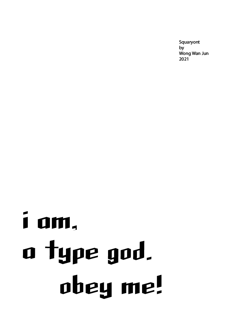
After finalize and generated our font design, we were required to come out a typography poster with phase given" I am type god, obey me!
Fig 2.14: Poster Designed, 5th June 2021
Final Outcome:
<iframe
src="https://drive.google.com/file/d/1maeDolADL4Fn2cAhAgRfE6YjqninGW7t/preview"
width="640" height="480"></iframe>
FEEDBACK
Week 9:
General Feedback:
It is essential to examine the font design with readability, consistency and legibility and start designing with letter o, as the curve is is related to a and g. Prevent to have heavier loop than main part (especially 't'). Create the main fill, see the proportions.
Specific Feedback:
Try out first typeface design, it is more beautiful and challenging.
Week 10:
General Feedback:
Remember to document sketches of idea and process of generating font (FontLab) in e-portfolio.
Prevent watching tutorial while doing tasks as it may cause missing of important details.
Specific Feedback:
Typeface a bit confusing and need to maintain a single axis(direction). After amendment should be fine.
REFLECTION
This assignment is the most challenging one so far, it require a lot of attention and effort. I had a hard time making the font in Illustrator as the minor details are hard to be crafted to perfection. One thing that I have learned is to make use of the shape builder and pathfinder tools. Beside it was very frustrating when the paths don't meet each other and had to adjust little by little. My mindset was as long i'm satisfied with it it's alright, not everyone is born to be a font designer...I honestly thought Mr.Vinod and Mr. Shamsul are going to think that it is bad. My font looks like square and when it meets font = squaryont! Anyway i am pretty satisfied with my final font and poster design, i will try to keep working to complete my first font design :D
The sense of fulfilment is real, it's like a dream come true.
FURTHER READING
 |
Fig 3.1: Why Handlettering is Not Type, 6th June 2021
https://www.printmag.com/post/why-handlettering-is-not-type |
In this article, I have learned that 'type' refers to prefabricated letters that can be set, rearranged, disassembled and reused. Its forms are fixed by a designer, not created by a user. “Lettering” describes letters that have been drawn by hand, no matter whether the tool implemented. It involves combining letters to form a composition that is greater than the sum of its parts. The individual letters cannot be taken apart and put back together to form another word or phrase without some damage being done to the overall design.There are several factors mentioned in this article, which distinction between lettering and type can be blamed on.The first is type is no longer tangible, something that can be held in the hand. Pixels have replaced metal and wood. Today, type exists as an image, something that can be seen. For those familiar only with fonts, every letter onscreen or in print is presumed to be a character in a typeface.
The second factor is the discontinuation of classes in penmanship in American elementary schools has left people with little experience in the physical act of creating letters. They have been “writing” with keyboards their entire lives. They struggle to write notes, and most cannot even sign their name with any semblance of personality.
A third factor is most American design schools abandoned classes in calligraphy and lettering. Educators believed that hand-skills were antiquated. Thus, most young designers have not had firsthand experience learning how to draw letters outside of a program like Adobe Illustrator. Not only do they not know how to draw letters, they don’t fully understand the hard work that is required to achieve lettering of quality. Instead, anything done by hand is applauded. Witness the fawning adulation that greets the overwhelmingly mediocre handlettering work posted online in recent years.


 Fig 2.1: Deconstruction of letter 'a' & 'e', 20th May
2021
Fig 2.1: Deconstruction of letter 'a' & 'e', 20th May
2021


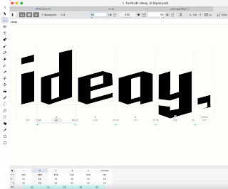
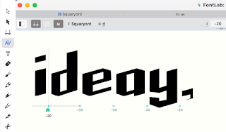
 Fig 2.10: Font Setting in FontLab, 5th June 2021
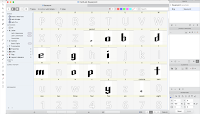


Comments
Post a Comment