Typography / Exercises
29.03.2021 - 02.05.2021 (Week 1 - Week 5)
Bachelor of Computer Science (School of Computer Science and Engineering)(Minor)
Task 1 / Exercises
- basically a creation of a typeface and it is widely used in animations, software applications, website, products labeling, signage system etc.
- plays an important role in delivering information.
- For example, the effectiveness of signage system is directly proportional to the skill levels in typography.
- bad typeface will lead to misconceptions and ramifications.
- was early developed by Phoenician back in 4th Century B.C.E.
Timeline of typography development

|
| Fig1.2: Timeline of Serif Typefaces |
Jargon in Typography

|
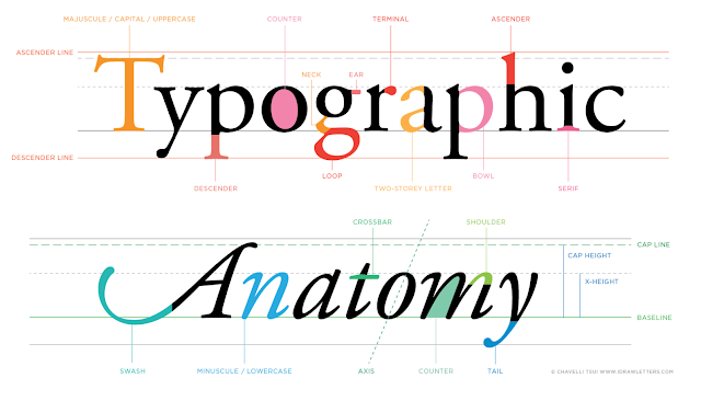
| Fig1.3: Typography line terms |
- Baseline
- Imaginary baseline
- Median
- Imaginary line that defines x-height
- x-height
-
Height of the lowercase x in any typeface
- Stoke
- Any line that defines basic letterform
- Apex/ Vertex
- top point where two strokes are joined together(A for upper, V for bottom)
- Arm
- when a horizontal stroke is not attached to a stem on one end
- Barb
- Half serif finish of curved stroke
- Bowl
- circle found in letterform. Eg. d, b, c, e, o, etc.
- Cross stroke
- stoke found in lowercase t and f.
- Crotch
- Interior space within letterform
- Descender
- part of letter drops below baseline. Eg. g, j, p, q, and y.
- Finial
- curved of tapered end of a stroke.
- Ligature
- special character that joined 2 characters
- improve the efficiency of reading. Eg. fi.
- Spine
- S is the best example for spine.
- Stress
- diagonal or vertical change in stroke width across a letter.
-
Diagonal stress is based on handwriting.
- Small uppercase
- uppercase letterforms drawn to x-height of the typeface.
- prevent visual disruption when a lot of uppercase letters were used together.
-
Roman- book
- Boldface -thicker stroke then roman form
- Light
- Condense - Roman form in compressed state
- Extended
- Italics refers to Italian handwriting
- Oblique is based on Roman form of type face.

|
| Fig1.4 : Italic vs Oblique |
9 most essential typefaces that represent 500 years of type design:

|
| Fig1.5 : Typefaces from lecture's video |
Week 4: Text 1
Kerning
- automatic adjustment of space between letters.
- kern when using full uppercase letters.
-
need to add space between the letters
Tracking
- addition & removal of space in word / sentence
- blackspaces between the white.
- is broken when adding spaces between letterforms.
- once broken, readability reduced.
Lowercase letterforms require counterform to maintain the line of reading.

|
| Fig 1.6: Kerning & Letterspacing |
Text Formatting
- Flush left
- Each line starts at the same point and ends accordingly to its last word.
- Spaces are consistent throughout the text, allowing the type to create even grey value.
- Centered
- Symmetry upon the text, assigning equal weight & value to both ends of line.
- Flush right
- Emphasis on the end of line as opposed to its start.
- Hard to read.
- Justified
- achieve symmetrical shape by adding / reducing spaces between words.
- Type Size
- Large enough to read easily at arm's length
- Leading
- Over-tightly type encourages vertical eye movement (readers lose focus easily)
- Over-loosely type creates stripped patterns that distract readers.
- Line length
- Shorter line requires less leading
- Longer line requires more leading.
- Keep line length between 55-65 characters.
- Extremely long / short line lengths impairs reading.
- Provide an accurate reference for type, type size, type leading, type line length etc.
- Shows samples of typefaces in various different sizes (allow reasonable type choice)
- Compositional Requirement
- Text should create a field that occupy a page / screen.
- Enlarge type to 400% on screen to get clear sense of relationship between descenders on one line and ascenders on line below.
-
Nothing replaces looking closely at an actual point out of
work.
Week 5: Text 2
Indicating Paragraph
- Pilcrow -- 
- indicate paragraph space.
- Line space
- Indent
- size of line spacing / point size of text
- Indentation is best used when the text is justified.
- ragging on right is bad.
Widows & Ophans
- Reducing 0.5pt
- match with fonts x-heights
- don't stand out in a small amount of text
- In document which contains large amount of texts, lowercase numeral is recommended.
- Maintain left reading axis when highlighting text.
- ensure good readability.
- Graphical elements bullet points can be placed outside the margin
-
Single ' : foot ; double '' : inches
Information of Hierarchy
- A Head
- main headline
- B Head
- subheadline
- C Head
- lorem Ipsum
Cross Alignment
- reinforces architectural sense of the structure of the page.
INSTRUCTIONS
TASKS
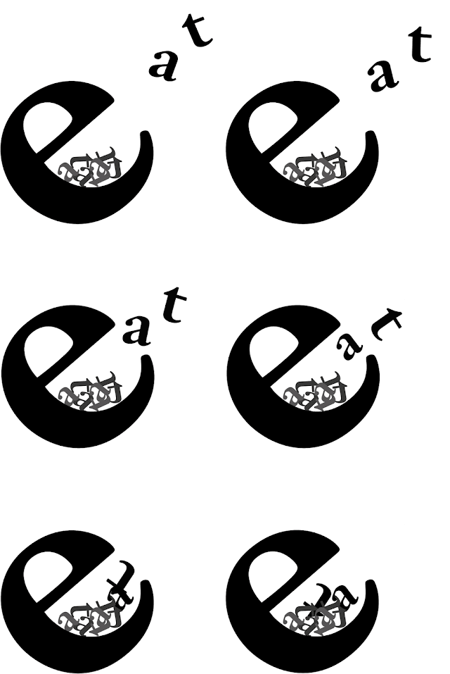
Word selected: Point, Eat, Slice, Spin
Sketches:
|
Digitized Words:
|
|
FEEDBACKS
For word expression, most of us are insufficient in exploration and slightly word distortion is allowed. We are advised to prevent using graphic elements other than the shades of grey to express the words. Mr. Vinod reminded us to ensure we had done our weekly task before class and avoid getting late to class.
I have received feedback from group divided. They like my word design layout which is clean but more exploration will be better.
Mr. Vinod asked us not to delete other people's feedback and change the default typeface. Also, switch on the camera to ensure we are concentrated in class.
Specific feedback:
Overall the expressions match the word meaning except for “point” can be improved. They did sit well on art-board but some of the composition was not enough impactful. I should explore more to improve my design.
Week 4:
General feedback:
Mr Vinod encouraged us to read some related books and
reminded us to update our e-portfolio weekly.
Specific feedback:
Mr Vinod & Mr Shamsul commented on my e-portfolio.
They reminded me to add the horizontal rule to my blog and date
to image caption. Also, read some related books so I can fill
further reading section. Mr Vinod suggested me on type animation
to upright my alphabet 'e' while alphabet 'a' and 't' drop from
top.
Week 5:
General feedback:
Mr Vinod reminded us to watch prerecorded youtube lecture
video.
Specific feedback:
The kerning and tracking is appropriately done. Adjustment of font size(10pt), line length, leading(12pt) & paragraph spacing(12pt) is suitable and choice of left alignment is pleasant to read. Well controlled ragging and established cross-alignment. Widows and orphans present.
REFLECTIONS
I was immersed throughout first lecture given and looking forward to next lecture. After first lecture, I have a clearer understanding on what I am going to learn in this module and what should I do to gain more relevant knowledge. It was undeniable that this module requires a lot of effort in order to complete every tasks given on time. I hope that I could handle this module well.
Observation:
Although online learning was a big challenge, both lecturers and students are giving full cooperation on communication. We are able to communicate effectively through online platforms. Our doubts were solved instantly and lecturers were able to receive our respond immediately. However, being a disciplined student is a prerequisite for virtual learning.
Findings:
I was inspired when watching video given and doing some readings. Reading is crucial for typography as we could gain better sense and understanding something that cannot be taught by others. It was not easy to process a creative design as every design has a story and it required designer to work hard enough. Documenting every design process was beneficial for me because it makes me feel organised.
FURTHER READING
 |
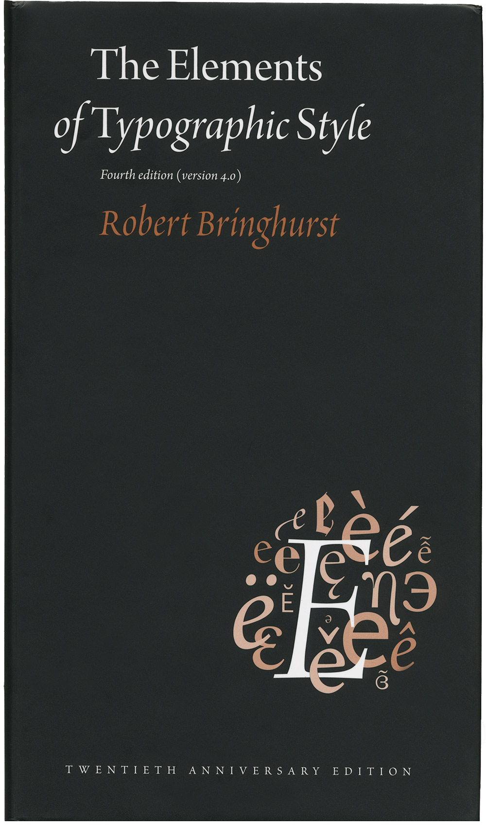
| Fig 5.1 The Elements of Typographic Style by Robert Bringhurst, 5th May 2021 |
 | |
|
 | |
|


Comments
Post a Comment