Illustration & Visual Narrative // Exercises
29.03.2021 - 02.05.2021 (Week 1 - Week 5)
Wong Wan Jun (0338248)
Bachelor of Computer Science (School of Computer Science and
Engineering)(Minor)
Illustration & Visual Narrative / Exercises
LECTURES
Week 1: Introduction
Week 1: Introduction
Our first lecture began with a brief introduction and software that
will be implemented by friendly lecturers, Ms.Noranis and Mr. Kannan.
This module is focus on creating visual concepts from students' ideas
and pictorial communication to an audience in the form of
illustrations. In order to do so, we need to complete exercises
about character design, poster, animated GIFs and motion comic.
Week 2: Charater Design // Pear Chiaroscuro
Week 3: Visual Techniques (1) // Pear Chiaroscuro
Week 2: Charater Design // Pear Chiaroscuro
- Principles of Character Design
- Shapes
- Colour
- Emphasis & Contrast
-
making the character outstanding & memorable
- Harmony
-
every element used must put together in tasteful manner.
(VISUAL HIERARCHY)
- Expressions/Poses
- Pear Chiaroscuro

|
| Fig 1.3: Pear Provided |

|
| Fig. 1.4: Pear Chiaroscuro |
Week 3: Visual Techniques (1) // Pear Chiaroscuro
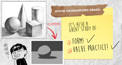
1. Visual Techniques - Chiaroscuro
- use light & dark to create illusion of 3D volume on a flat surface.
- Reason used
2. Visual Techniques - Composition (1)
- Establishing
- establish the audience where the story happen.
- Bird's Eyeview
- place audience on top.
- "Framing"
- surround focal point.
- to create different mood & setting.
- Medium Shot
- focal point is always big & visible.
- Close-Up
- focal point is always bigger & more visible.
- Worm's Eye-view
- place audience on ground.
- forcing audience to look at focal point. (forced perspective)
- Composition Rule 1
- balanced distribution of Positive Spaces VS Negative Spaces (Chiaroscuro)
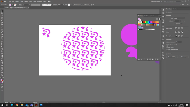
3. Adding Texture to Pear Chiaroscuro
- Clipping Mask
Week 4: Visual Techniques (2) // Useful Illustrator Tool
1. Visual Techniques - Composition (2)
- Perspectives
- to create DEPTH
- create a 3D optical illusion from a 2D surface
- as long as mimic "3Dimensions", sense of DEPTH is created
- Types of Perspectives
- 1 point
- 2 point
- 3 point
- 4-5 point (fisheye)
NOTES OF PERSPECTIVES
2. Useful Illustrator Tool
INSTRUCTIONS
<iframe
src="https://drive.google.com/file/d/1KUv2-fEi0ZC9tYvVxoQN3TEo5w6dcdM9/preview"
width="640" height="480"></iframe>
TASKS
Exercise 1 - VOMATOR CHALLENGE
Vormator is the ultimate challenge of creativity and we are given an opportunity to show our abilities to create a stunning piece with limited means. We were given 8 shapes which were showed below.
 |
| Fig 2.2: Vormator Designed |
 |
| Fig 2.3: Illustration of Snagon |
 |
| Fig 2.4: Snagon (Edited) |
Exercise 2 - Vector landscape illustration
This exercise is all about vormator character background and card layout design. For background, we need to create a landscape illustration out of vector shapes for our monsters. The theme and colour scheme of landscape is not restricted. After that, we can create our own game card.
A landscape of mountain surrounded by cloud for Snagon because it loves riding on wind.

|
| Fig 2.6: Sketches of Background |
 | ||
Fig 2.7: Finalize Landscape
|
FEEDBACKS
Week 1:
No feedback received.
Week 2:
No feedback received.
Week 3:
Ms Anis has commented on my character designed and pear chiaroscuro. She suggested me to add some designed to Snagon's head so it wont be too flat and said my pear and snagon were interesting :D.
Ms Anis has commented on my character designed and pear chiaroscuro. She suggested me to add some designed to Snagon's head so it wont be too flat and said my pear and snagon were interesting :D.
Week 4:
No feedback received.


Interesting depiction of pear and snake hehe
ReplyDelete<3
Delete