Digital Photography & Imaging_Week1 - Week4
29.03.2021 - 25.04.2021 (Week 1 - Week 4)
Wong Wan Jun (0338248)
Bachelor of Computer Science (School of
Computer Science and Engineering)(Minor)
Digital Photography &
Imaging // Project 1

Week 1: Introduction & Briefing
- Focal Point
-
key element to any good composition
- helps viewers’ eyes naturally focus on important pieces of design first.

|
| Fig1.1 :Good composition with strong focal point |
- Scale & Hierarchy
-
often used to help communicate hierarchy
- drawing attention toward and away from certain elements, thus signifying their importance to the communication.

|
| Fig1.2 :Good composition with good scaling |
- Balance of Elements
- good technique for mastering asymmetrical balance.
- think of each element as having a ‘weight’ to it.
- Smaller objects might ‘weigh’ less than larger objects // heavily textured elements might ‘weigh’ more than flatly coloured elements.

|
| Fig1.3 :Example of asymmetrical balanced composition |
- White Space
-
known as “empty space” to balance up the main focus.
-
used strategically to boost design’s clarity
- overall look by balancing out the more complicated and busy part with space that helps design to breathe.

|
| Fig1.4 :Example of image with white space |
- process of dividing an image into thirds, using two horizontal and two vertical lines.
- any horizon is suggested to placed on either the top // bottom horizontal line
- position the most important elements at intersection points
- produce a much more natural image.
-
it is a way to:
- create conversation between subject and background.
- use negative space creatively
- use composition techniques that are in line to naturally pleasing to the eye.

|
| Fig1.5 : Rule of Thirds |

|
|
Fig1.6 : Example of Rule of Thirds |
- mathematical ratio that commonly found in nature.
useful guideline to determine dimensions of layout.
-
simple way to apply Golden Ratio
- set your dimensions to 1:1.618
-
used in design
-
creating a sense of beauty through harmony and proportion.
- foster organic and natural-looking compositions
- aesthetically pleasing to the eye.
- provides a sense of artistry.

|
| Fig1.7 : Golden Ratio |

|
|
Fig1.8 : Example of Golden Ratio |
- Website Referred
2. Lasso Tool
- draw and pinpoint specific areas of a document & similar to pencil.
- give a better flow when drawing and making selections.
- three tool options:
- Lasso
- Polygonal Lasso
- Magnetic Lasso
 |
| Fig1.9 : Lasso Tool |
3. Pen Tool
-
create extremely precise shapes and paths, using manually placed anchor points.
- determine the path by points added and method of dragging them.
- fewer points, smoother path.
- not natively made as a “selection tool”
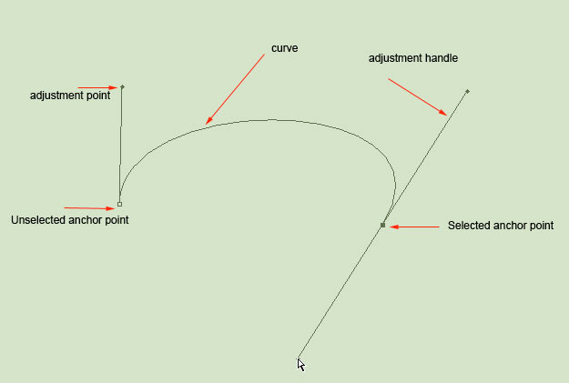 |
| Fig1.10: Pen Tool |
 |
| Fig1.11: Variation of Pen Tool |
- different images stacked on top of each other.
- make adjustment on each layer without affecting another one.
- combine them to form a final image.
- allow saving a Photoshop file with all layers included.
- can use layers for non-destructive editing.
- never destroy the original image.
 |
| Fig1.12: Adjustment Layer |
- add colour and tonal adjustments to your image without changing pixels.
- edit and discard adjustments // restore original image at any time.
- Top 5 Adjustment Layer:
- Brightness // Contrast
- Brightness: adjust highlights
-
Contrast: adjust shadows
Fig1.13: Brightness/Contrast - Level
-
modify tonal values by adjusting levels of shadows,
midtones and highlights.
Fig1.14: Level - Curves
- the most powerful and precise tool for editing the tones in an image.
-
adjust points as throughout the entire range
of image.
Fig 1.15: Curves - Exposure
- adjust exposure levels with three sliders: Exposure, Offset and Gamma.
- Exposure: adjust only the highlights of the image.
- Offset: adjust the mid tones.
-
Gamma: adjust dark tones only.
Fig1.16: Exposure - Selective Colour
-
selectively modifies amount of primary colour without
modifying other primary colours in image.
Fig1.17: Selective Colour


 |
| Fig1.18: Filters |
- change colour, add blur or create completely new image effects.
- photo filter trick in Photoshop
- https://youtu.be/gDSbfx67MLg P
TASKS

|
|
Fig2.1: “All in my Head” by Ben Giles (2014)
|

|
| Fig2.2: “BIRDS IV ON CANVAS” by Anna Sidi-Yacoub
I was fond of this graphic due to its gloomy tone and it was a visual celebration of human nature and life. A woman was constrained by traditional ideas. It was emphasized as her neck was surrounded and sight was blocked. The flying pigeon portrayed her desire to be free-minded. It allows audience to break away from the traditional representation of various visual realities. |
Design 3

|
| Fig2.3: “Kukbuk Collection - Sensor” by Aleksandra Morawiak |
“Sensual” is a unique calendar and different elements represent a combination of thoughts and passions. At first sight, this artwork may look complicated due to implementation of different elements. However, the overall tone was comfortable and pleasant as baby blue brings the feeling of tranquility while cream colour is relaxing. It was vivid after adding various types of elements.
PROJECT 1A: PHYSICAL COLLAGE
 |
| Fig 3.1: Physical Collage (1) |
 |
| Fig 3.2: Physical Collage (2) |
 |
| Fig 3.3: Physical Collage (3) |
PROJECT1B: DIGITAL COLLAGE_PATH ,PEN TOOL, LASSO TOOL
On week3, we were focused on selection tool. I learned how to use the pen tool, lasso tool and layer. I prefer using polygonal lasso tool, it gives me a better flow when making selection and it is easy to use. Big thanks to the Bezier game, it helps me to get used with pen tool. For me, pen tool is harder than lasso tool even it is smoother but I not really like dragging these points :D Lastly, I learned how to make changes on each layer without affecting others and destroying the original image.
 |
| Fig 4.1: Screenshot of Work Progress |

|
| Fig4.2: My Composition on Week 3 |
PROJECT1B: DIGITAL COLLAGE_ADJUSTMENT LAYERS & FILTERS
Fig 4.3: Screenshot of Work Progress

Fig4.4: My Composition on Week 4

Mr. Fauzi suggested me to enlarge 'shark' and select it nicely so that whole collage looks connected and precisely. Besides, darken 'factory' and 'kancil' in order to create a strong contrast between them.
 |
| Fig4.5: Finalized Digital Collage |


Comments
Post a Comment